Complex Topics – Getting to the Heart of the Matter
Making the essential information about a research project quickly understandable by means of visualization: Research posters are increasingly being used for this purpose. Poster sessions complementing a lecture program have become a standard feature at academic conferences. As part of the most recent evaluation of the Institute by its advisory board, young researchers presented the topics addressed in their doctoral and post-doctoral theses in a poster session.
Visualizing research projects – how is that supposed to work? How can topics, hypotheses, and findings be presented graphically in the milieu of legal scholarship, a discipline based entirely on words? Several doctoral students and postdocs at the Institute took on this challenge under the guidance of Kilian Krug, a design consultant who regularly works with academics from various disciplines.
The Process

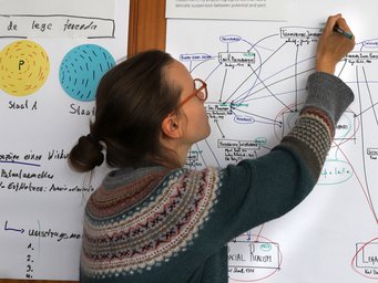
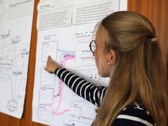
As the first component of a workshop session, the essential content was gathered together. Then, this material was reduced and condensed in the form of 90-second topic presentations and initial small-format sketches. During this stage, Krug provided creative input, sharing examples from art and design that illustrate how abstract relationships can be effectively depicted and explained. In the next step, the participants created hand-drawn poster sketches, which they then presented at the end of the workshop. After final coordination communicated by email, graphic implementation was undertaken by the design professional, thereby concluding the collaborative effort.
Visualization
Diagrams are rarely used in legal scholarship. When designing a legal poster, the question therefore arises as to how abstract concepts, thought processes, rules, principles, hypotheses, theories, and methods can be graphically depicted in a meaningful way.
„It's always exciting to see how each research project
crystallizes into its own unique presentation.”
– Kilian Krug –
“When attempting to visualize complex content, a good start is finding fitting metaphors and then identifying their characteristics in relation to your own work before thinking through them further and further. Or you can start by sketching out a kind of 'map' of your own field of research, with specification of the key players, areas, and contexts.”

Once the poster concept has been defined in terms of content, the information graphics work begins: creating categories and sorting through the elements – whether chronologically, hierarchically, or according to some other criteria. Connecting lines, border lines, arrows, colour coding, and various basic shapes are used to represent different dimensions of the topic.
The elements selected from this graphic vocabulary are logically combined and arranged in a kind of visual grammar in the poster format – where possible, they are distilled and simplified once again at the end.
“It's always exciting to see how each research project crystallizes into its own unique presentation,” says Krug.
What Matters

A science poster conveys a large amount of material in a small space. It must arouse interest and provide a quick introduction to a topic. Its design should be tailored to a very specific purpose and a clearly defined target group. Does it mean to present a topic, to facilitate a short lecture, or to prompt a discussion? Is it aimed at specialist colleagues or a wider audience? In all cases, it is worth investing the same care that you would put into formulating an oral presentation. In the end, the art of persuasion is not limited to words.
Kilian Krug is a consulting designer specializing in information and system design. Among other activities, he holds workshops on visual work and communication in the fields of research, science communication, and interdisciplinary collaboration.
Illustration header: © AdobeStock, Christian Horz
Images: © Max Planck Institute for Comparative and International Private Law


